There are plenty of stunning buildings out there, feats of architecture and engineering so great that it’s hard to believe they exist. And then, there are the buildings that aren’t quite so… attractive or well-designed. The feats of architecture and engineering so ugly and, well, bizarre, that it’s hard to believe they ever passed the initial design stages. The offices, homes and hotels that find their way, time and again, onto “world’s ugliest buildings” lists.
While some of these buildings have come to be, if not loved, at least affectionately tolerated, for their terrible design, others struggle to find anyone to defend them. So, we decided to take a stab at “fixing” some of these ugly buildings, softening their sharp edges, replacing hideous 70s features and removing unnecessary elements. We hope you’ll agree they look much better for it!
J Edgar Hoover Building, Washington DC
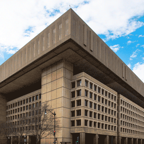
Location: Washington DC, USA
Height: 49m
Built: 1971-74
Architect: Charles F. Murphy and Associates
The headquarters of the FBI in Washington DC was designed by Charles Murphy and Associates and built between 1971-1974, finally opening in 1975. Described as the “swaggering bully of the neighbourhood” by the American Institute of Architects, this Brutalist design was originally intended to have sheets of polished concrete or granite attached to its facade. Which may have helped, somewhat. As it is, this building has few redeeming features, particularly viewed through a more modern lens.
Despite the fact that most organisations involved wanted the new FBI building to avoid a boxy, monolithic design, that’s exactly what they got. Competing views, planning problems and accusations of wasted space and money all blighted the construction process. The resulting building cost $126 million to build, which was a record at the time, so perhaps those accusations of overspending weren’t far off the mark!
What needs fixing? Although this building is considered no longer fit for purpose, there’s a lack of funding for new FBI headquarters, so we thought it could be improved by lightening its façade, and replacing the 70s bronze-tinted windows with clear glass. And removing the gigantic, monolithic roof structure (unbelievably, this is already one storey lower than it could have been!). It would be a start, at least.
Antilia, Mumbai
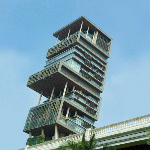
Image credit: Dion Hinchcliffe on Flickr
Location: Mumbai, India
Height: 173m
Built: 2010
Architect: Perkins and Will
Antilia is a private residence located in south Mumbai, owned by an Indian businessman. It’s been widely derided since its construction in 2010, not only because its design is somewhat like an “oversized vertical shanty town” featuring a mix of different floor heights and building materials. It’s also the world’s most expensive home, costing approximately $2 billion, and requires a full-time staff of over 600 people. With three helipads on the roof, space for around 200 cars and nine lifts in the lobby alone, you have to wonder why one single family would need so much space.
In a country where so many people are living below the poverty line, this ostentatious display of wealth is particularly jarring. However, that being said, many Indians are actually proud of it, taking it as a sign of what they can accomplish.
What needs fixing? With its bizarre design towering over the Mumbai skyline, it’s certainly eye-catching, however we think that it could definitely be made a tad more aesthetically pleasing. Like the other buildings on this list, it’s a regular feature on “world’s ugliest” lists, showing that money can’t always buy great design. We thought it could be improved by reining in some of the more jutting-out elements (technical term), lightening sections of the façade and adding a spot of greenery.
20 Fenchurch Street (AKA “The Walkie Talkie”), London
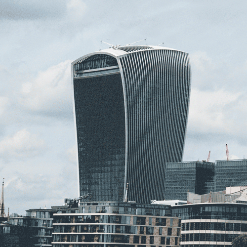
Location: London, UK
Height: 160m
Built: 2014
Architect: Rafael Viñoly
This one’s not just an example of somewhat less-than-attractive design (a “daily reminder never to let such a planning disaster happen again”, according to the Royal Town Planning Institute); it was once rather dangerous too. When it was first unveiled in 2014, the concave façade and mirrored glass focused sunlight in such a way that it created a concentrated beam powerful enough to melt cars and start small fires! Needless to say, people were not happy.
Fortunately, the 37-storey building has since been fitted with sunshades, however its design still remains the same. Described as “thuggish” and “bloated” in a review in The Guardian not long after its opening, it also went on to win the Carbuncle Cup, a somewhat dubious honour awarded to the ugliest new building in the UK each year, in 2015.
What needs fixing? Now that the problem with the sun has been fixed, we think what it would take to make this building look a little better would be to remove the bulge at the top, straightening its lines and making it look a bit less “bloated”, and hopefully removing it from consideration for future “world’s ugliest” lists.
Zizkov Television Tower, Prague
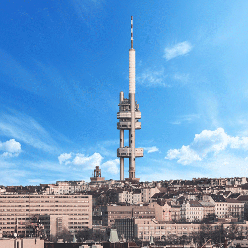
Location: Prague, Czech Republic
Height: 216m
Built: 1992
Architect: Václav Aulický
This building, built toward the end of the communist regime, features on almost every “Ugliest Buildings” list there is (and is now considered one of the weirdest buildings in the world).
Maybe it’s the fact that it “looks something like a NASA project placed arbitrarily on the outskirts of Central Europe’s most-treasured city”, according to Atlas Obscura. Maybe it’s the fact that its asymmetry looks particularly jarring against the stunning medieval architecture of Prague. Or maybe it’s the giant, nightmare-inducing fibreglass babies. Whatever it is, the Zizkov Television Tower is in dire need of a makeover.
What needs fixing? We thought the first step should be to get rid of the giant nightmare-babies (seriously, you just know they come alive and hunt at night (although people seem to like them?)). The second step should be to reconfigure the tower into a single pole structure, like the Berlin TV Tower or the Space Needle. While you can’t get away from the fact that this building just really doesn’t fit with its surroundings, we think that our makeover at least makes it look a little less hideous.
First World Hotel, Pahang
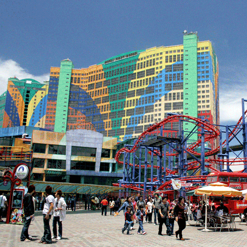
Image credit: Phalinn on Flickr
Location: Pahang, Malaysia
Height: 148m
Built: 2001
Architect: AIB Associates Architects Sdn Bhd
This one’s less of an architecture fail and more of a paint-job fail. An epic one at that. The world’s largest hotel by number of rooms (7,351), its façade is, for some unknown reason, clad in a garish pattern of multi-coloured stripes. It looks like what you might get if you asked a small child to pick a colour scheme for your massive hotel and resort complex (which is maybe what they did, who knows?). The colours are continued in the theme park just in front of the hotel, making the whole thing a bit of a mess. Especially considering its neutrally-painted neighbours (although one of them has a giant can of Coca-Cola sat against it, so…).
What needs fixing? Thankfully, we think all it would take to fix this is a new paint job. Can’t go wrong with white. We’ve kept the bright green roof to still keep a splash of colour though!
New Zealand’s Parliament Building (AKA “The Beehive”), Wellington
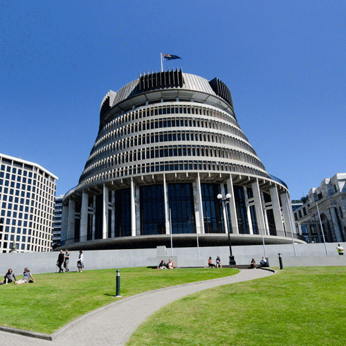
Location: Wellington, NZ
Height: 72m
Built: 1981
Architect: Sir Basil Spence
Looking all the more incongruous next to its Edwardian neighbour, Parliament House, this building was once described by Virtual Tourist as “a slide projector that fell on a wedding cake that fell on a waterwheel”. And, well, that’s not too far off to be honest. The “Beehive” as it’s known, is the executive wing of the New Zealand Parliament Buildings, houses the administrative and social activities of Parliament, and is where the Prime Minister’s office is located.
The fourteen-storey building (four floors are below ground) had a mixed reception. It was once voted the third-ugliest building in the world, and the circular footprint means that use of space is, at best, inefficient. However, Scottish architect Sir Basil Spence argued that it would be more resistant to earthquakes.
What needs fixing: We thought this building should be more in keeping with its neighbours, so our idea for fixing it involves softening the exterior by using some of the same style bricks, removing the angular concrete structures and replacing them with glass, replacing the square columns with classic round columns and losing the “slide projector” in favour of a domed roof.
The Chang Building (AKA “Elephant Building”), Bangkok
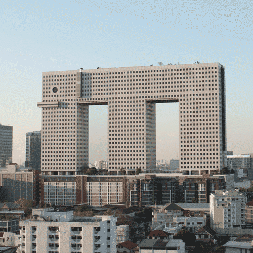
Location: Bangkok, Thailand
Height: 102m
Built: 1997
Architect: Ong-at Sattraphan
Named as one of the ugliest buildings in the world by Architectural Digest, no less, this building is something of an icon in Thailand, due to its resemblance to, well, an elephant (Thailand’s national animal). Situated in north Bangkok, it has 32 floors and is a mixture of residential, commercial and recreational space. While some may love this building (CNN deemed it an icon of construction alongside the likes of the Empire State Building and the Petronas Towers) and others may hate it, you can’t deny that it’s rather fun (and kids certainly love it).
The elephant’s ears are actually multi-storey balconies, its tusks house the offices of the building’s management company, and its tail is a column of smoked-glass-enclosed rooms. Much to the dismay of the managers of Lucy the Elephant, it became the world’s largest elephant building upon construction. Although, we can’t believe there are that many.
Love it or hate it, it has a place in the hearts of many Thai people and is most definitely unique.
What needs fixing? While this may upset many Thai people, the options as far as we were concerned were a) make it look like an elephant or b) don’t make it look like an elephant. There is no in between. We went for option b, and took away the eyes, ears and tusks. We also added a few more plants to the roof-top garden, because why not?