Forget simply choosing a shade of blue or green; it seems we’re increasingly taking our home styling cues from the pantry and the garden. A colourful and playful trend is taking over with designers and homeowners alike embracing food-themed interior design colours. Tapping into comfort and nostalgia while creating a feast for the eyes.
What is the Most Trending Colour Right Now?
Current trends lean towards food-themed interior design colours which have been heavily featured in the press as well as across social media.
Leading the way are soft, comforting shades such as butter yellow, offering a cheerful yet neutral warmth reminiscent of sunlit kitchens. Meanwhile, pistachio green has an organic, lived-in feel, perfect for creating serene spaces.
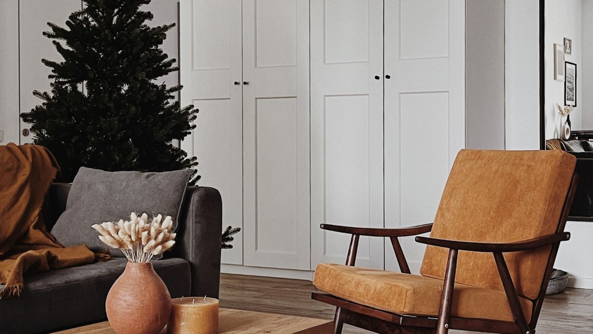
For those seeking bolder statements, tomato red injects energy and warmth while deep, luxurious chocolate brown and rich berry tones capture a sense of decadent indulgence.
These food-inspired hues strike an inviting and comforting tone, blending aesthetics with a touch of subtle culinary charm.
Discover more trending interior design colours, find out why maximalist interior design is making a comeback and learn more about the loud luxury interior design trend.
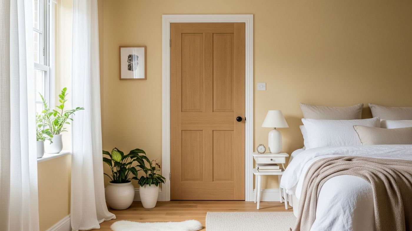
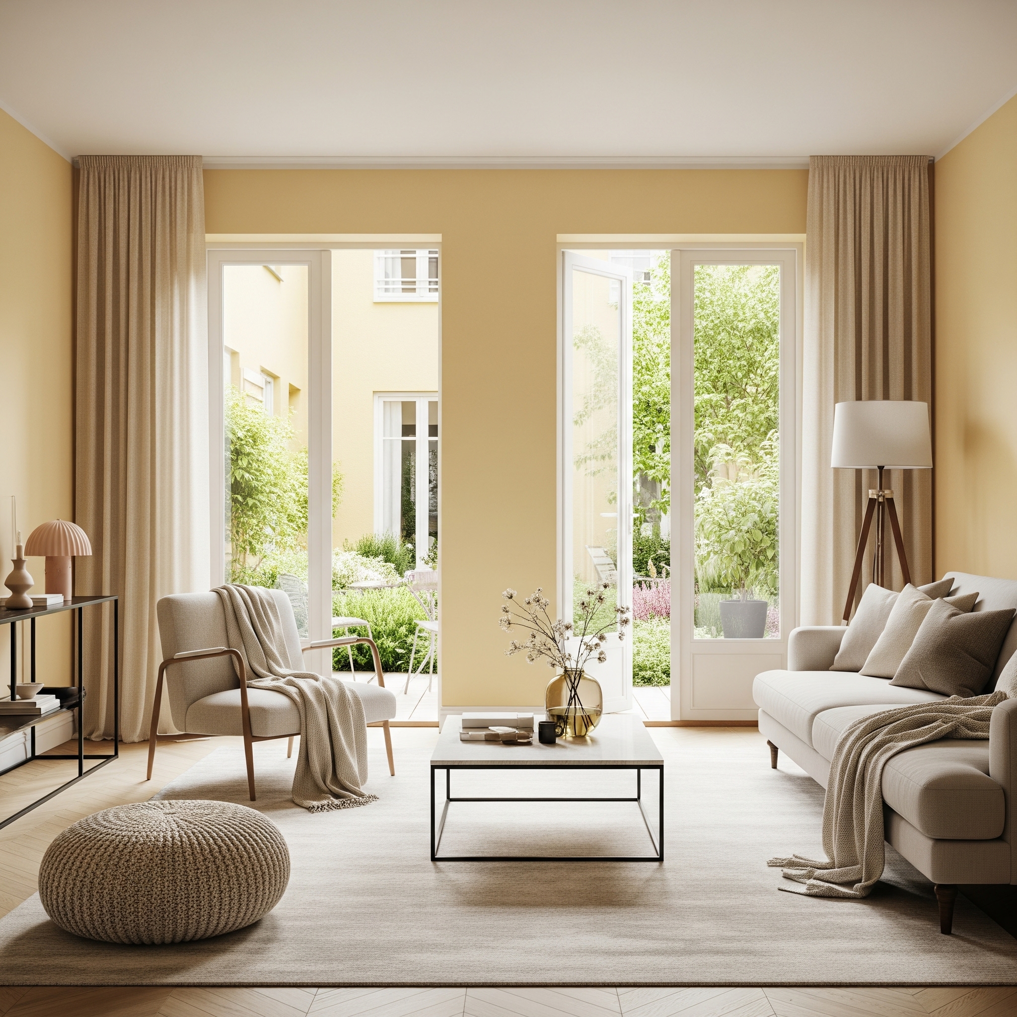
Butter Yellow
This soft, creamy yellow is the reigning champion of the trend. It offers the gentle warmth of a neutral with a distinctly more cheerful personality. Ideal for living rooms and bedrooms, it’s a great choice for modern farmhouse interiors and country homes. It also perfectly complements a French country style kitchen. Pair it with rustic oak doors for a cottage-inspired look.
Explore the modern farmhouse trend in more detail, learn how to lean into the cottagecore aesthetic and add elements of French country interior design for a chic home transformation.
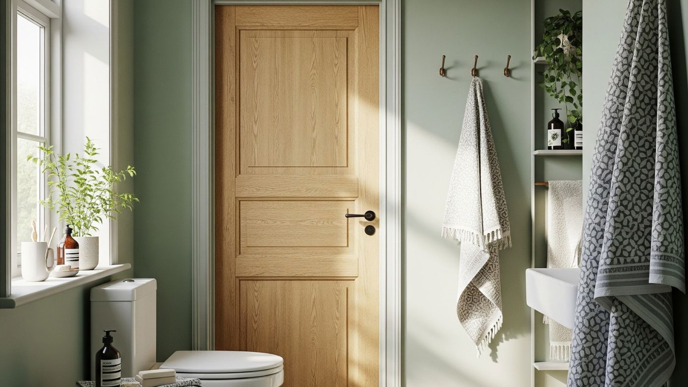
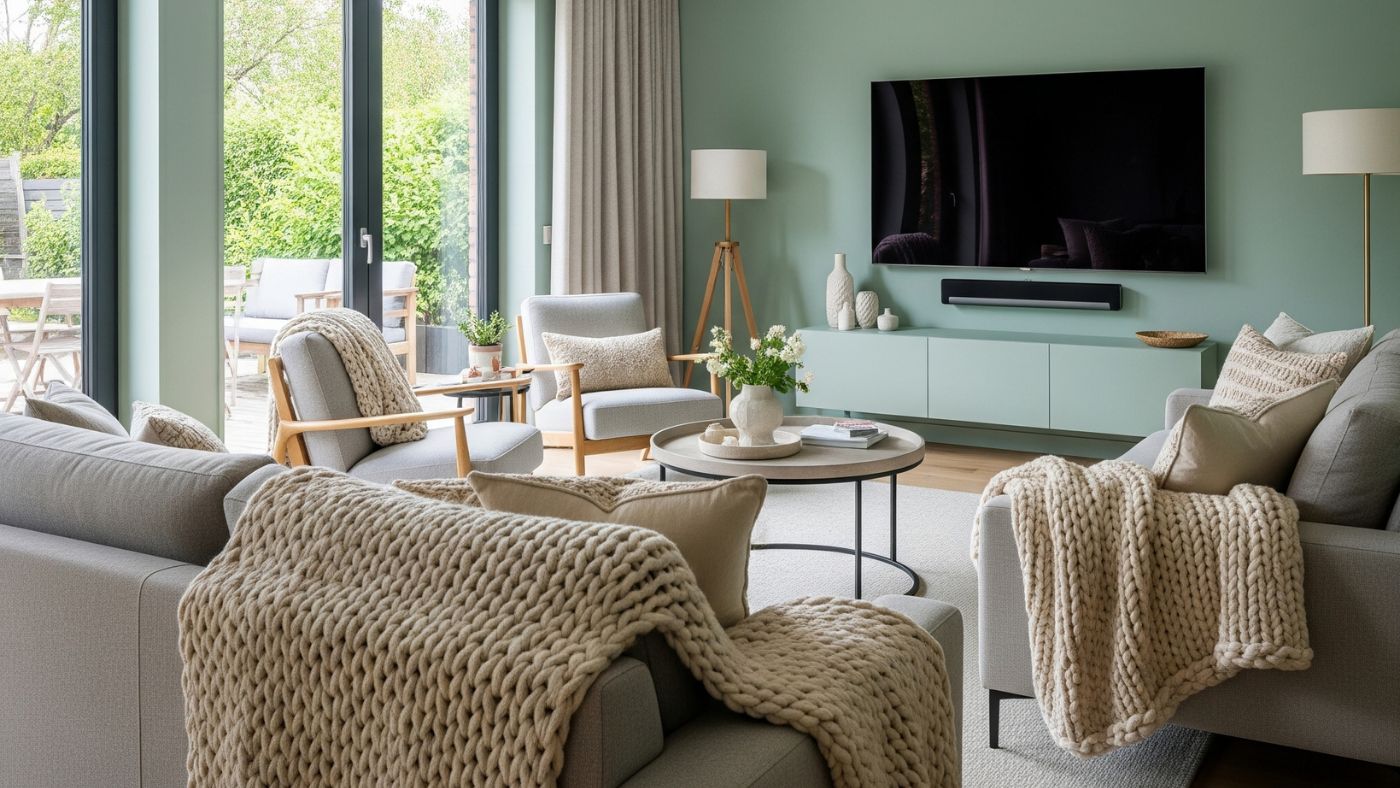
Pistachio Green
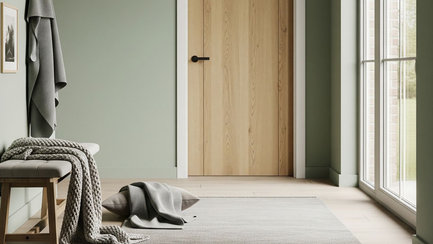
An uplifting and calming shade, pistachio green is proving incredibly stylish. It’s versatile enough for both traditional and modern aesthetics, bringing a fresh, organic feel to spaces and reflecting natural light beautifully. Team it with oak doors or white doors for a polished utility room or home office space. Alternatively, combine pistachio green with a modern English country interior design aesthetic for extra on-trend style points.
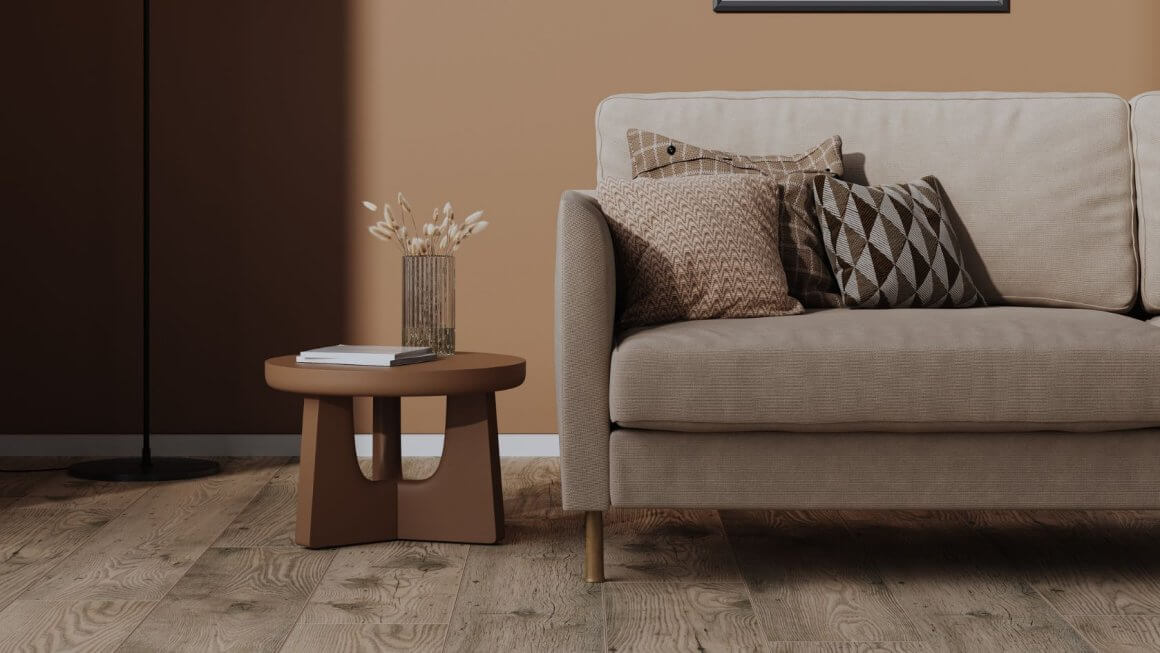
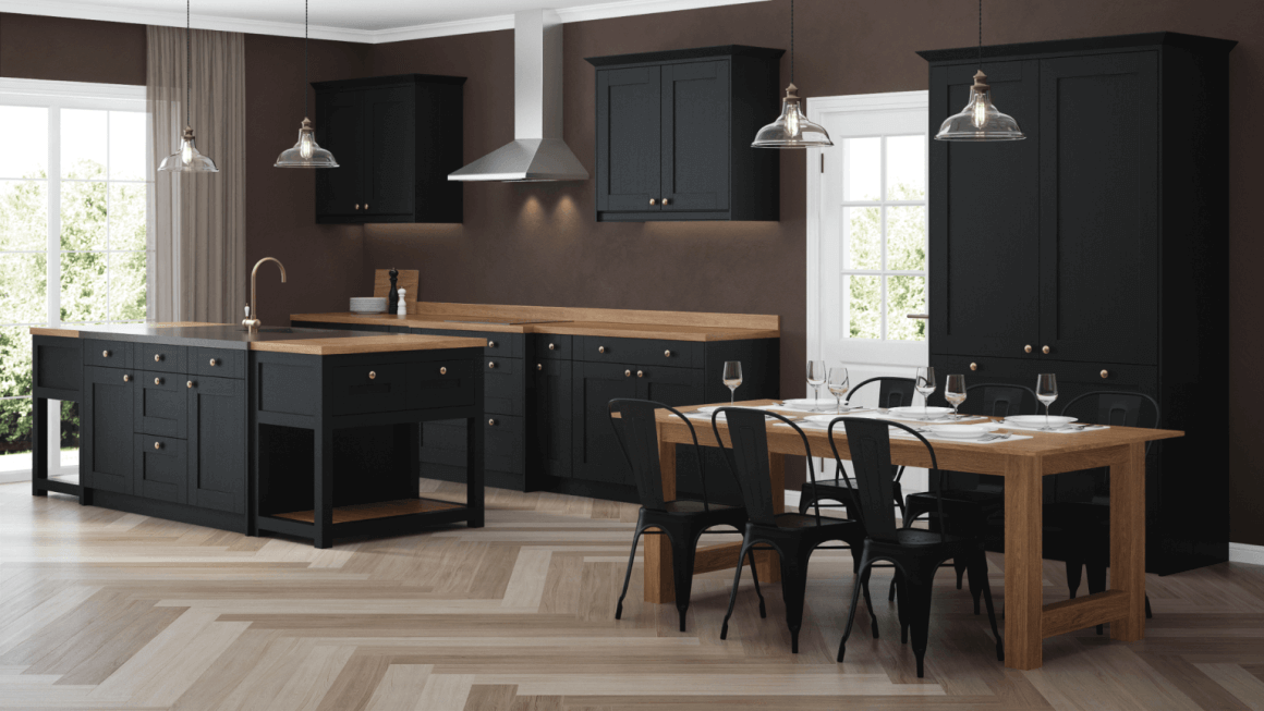
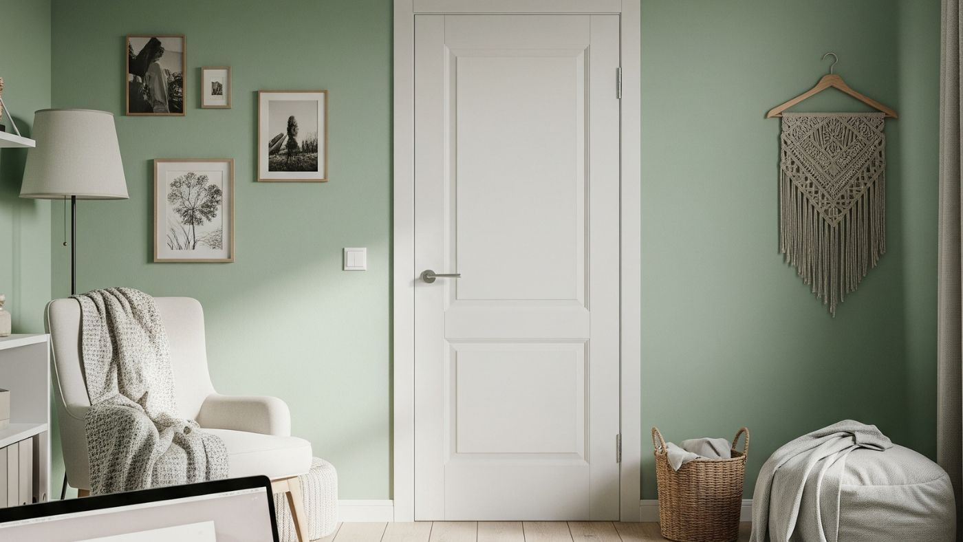
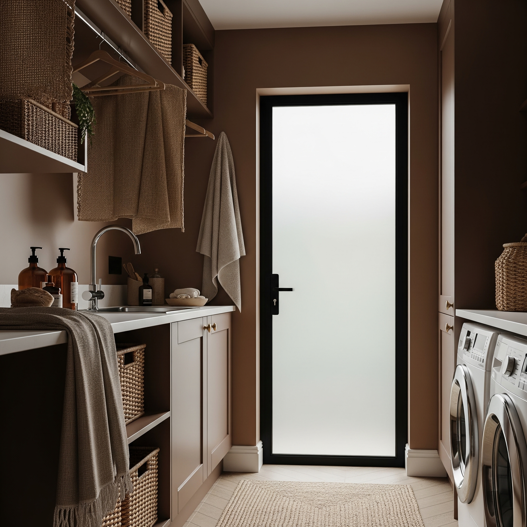
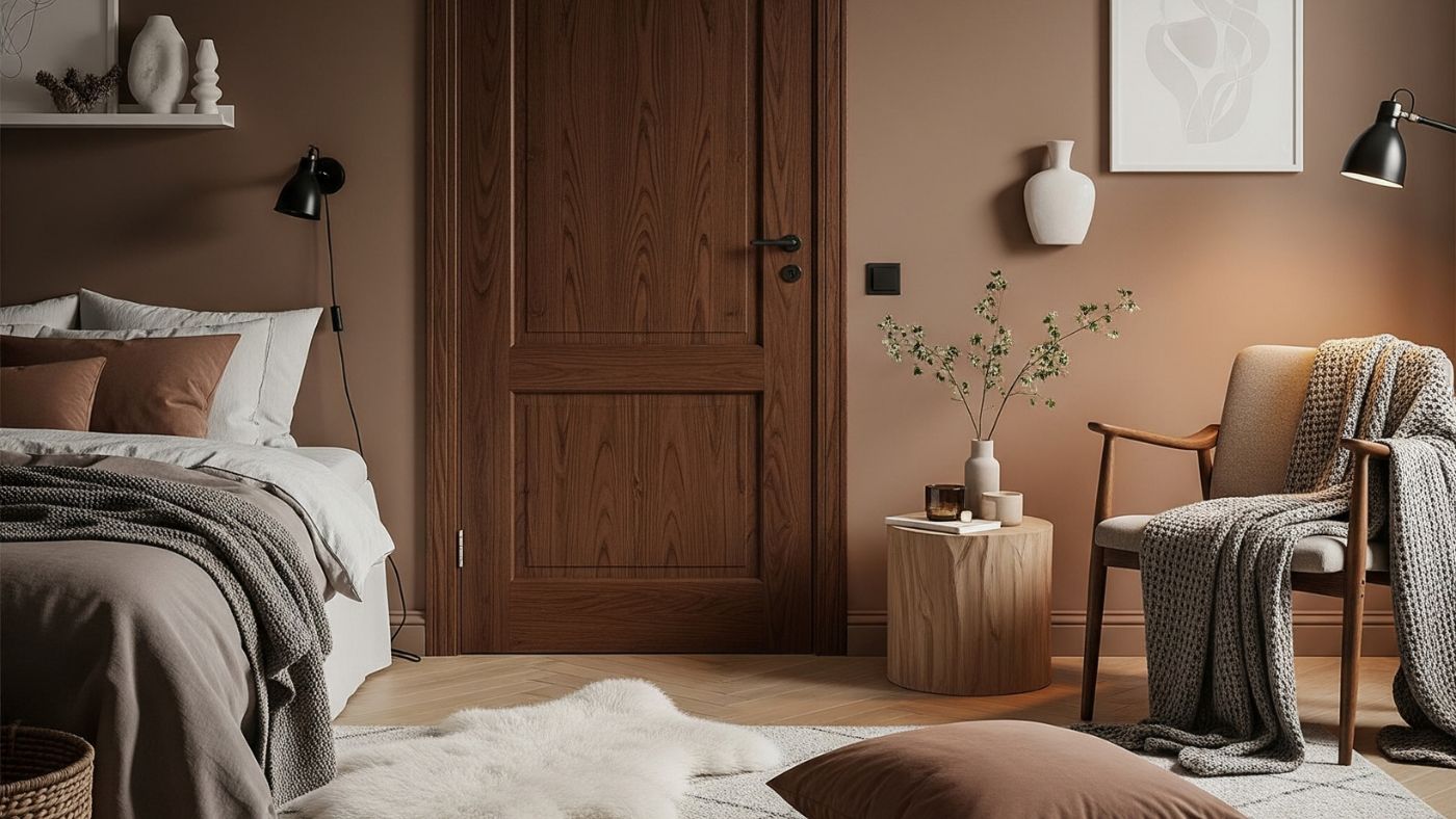
Mocha Mousse
The colour of the year 2025 is Mocha Mousse, a warming brown inspired by coffee and chocolate. This new take on neutrals serves well as a base for an entire room or can be blended as a rich-yet-muted accent in a bedroom or media room. When working with neutrals such as Mocha Mousse, opt for glazed doors or black industrial style doors to draw out an effortless quiet luxury home aesthetic.
Read our report on the chocolate brown trend and learn why brown home interiors are in style right now. While you’re here, get the lowdown on the quiet luxury interior design trend that started it all.
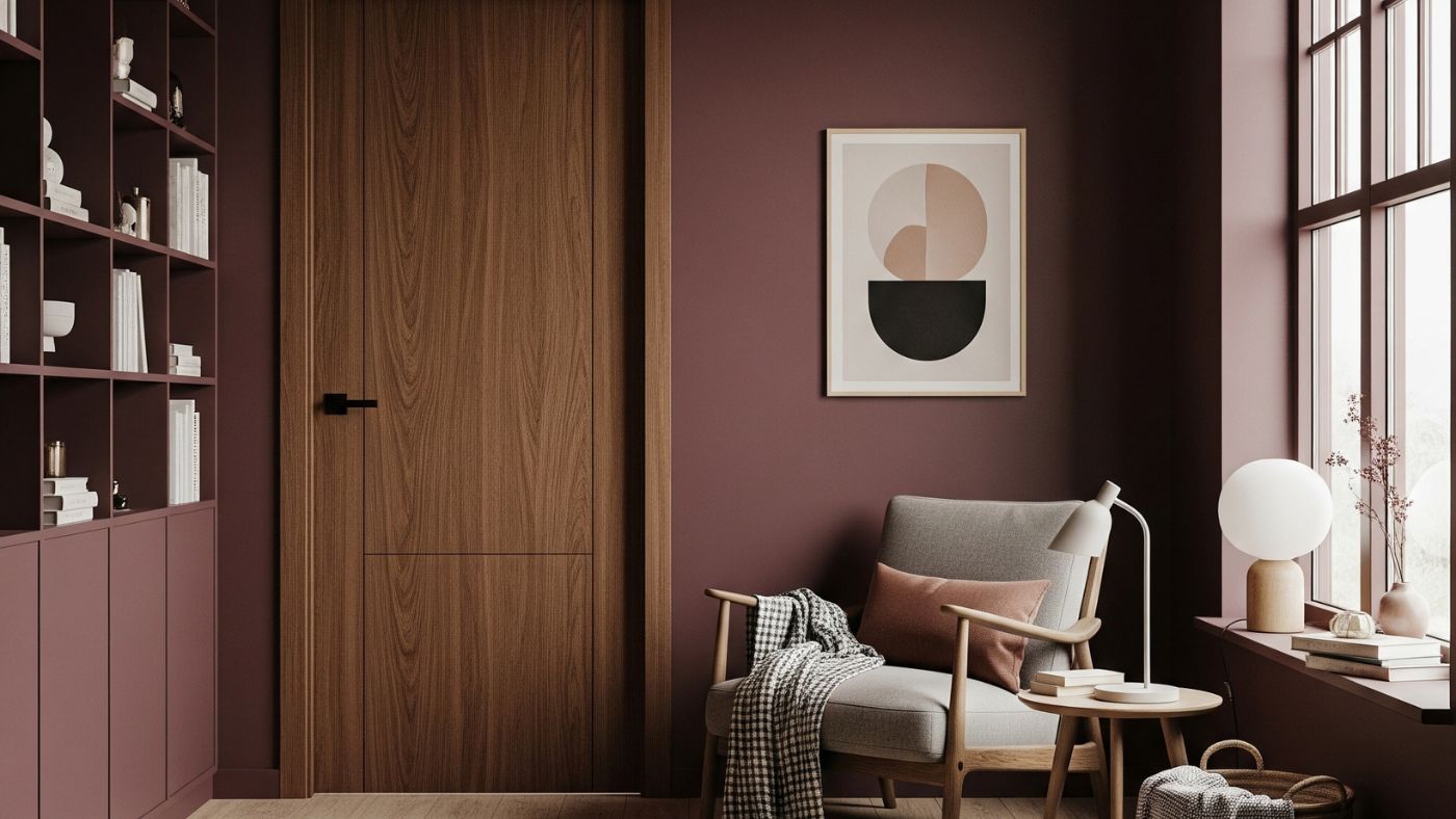
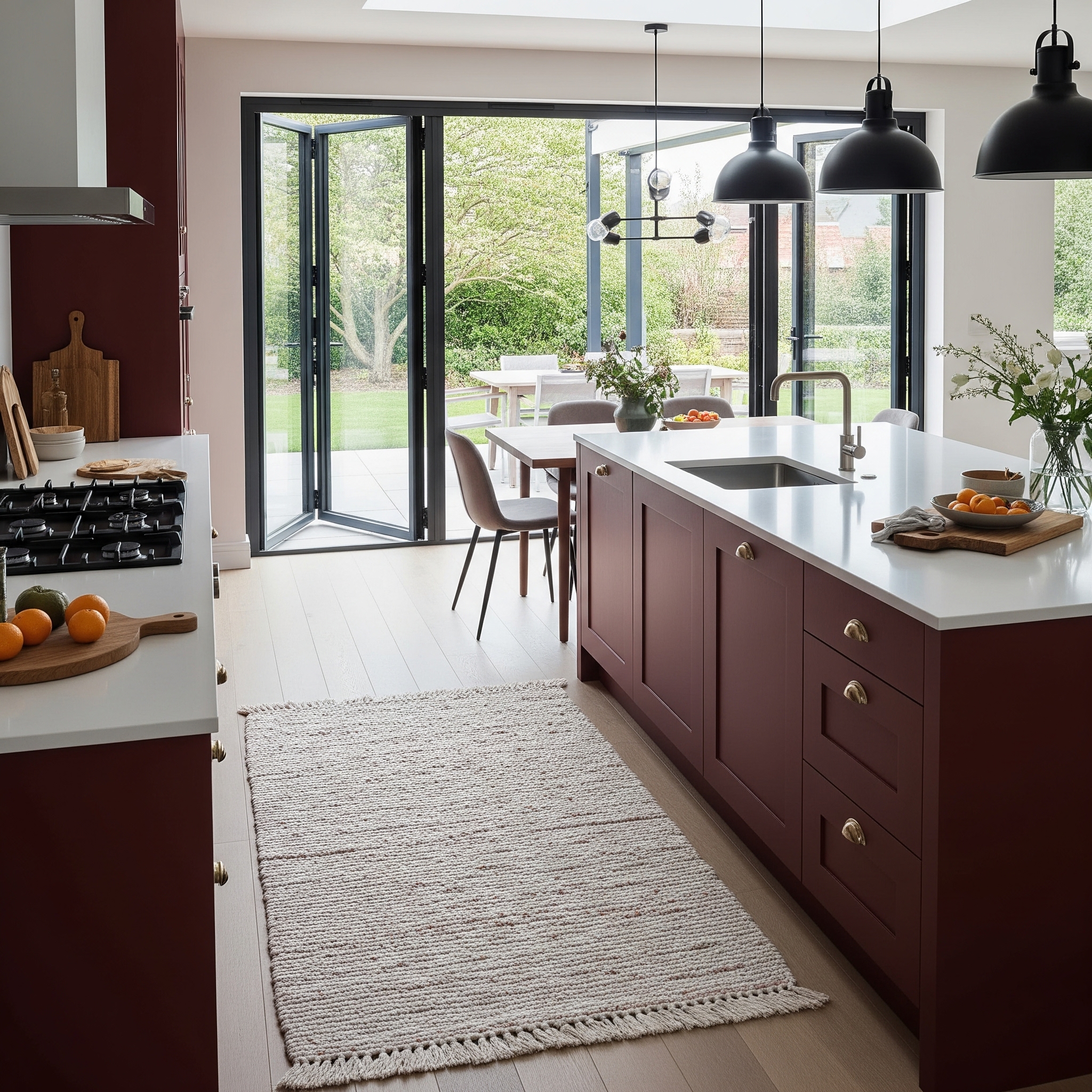
Berry Tones
From the deep, luxurious plum to the cherry cola colour trend berry tones instantly inject unexpected fun into any space. They make rooms feel cosier and more intimate, perfect for dining areas or guest bedrooms where relaxation is key. Beyond this, berry tones are super versatile, pairing beautifully with a variety of materials, from dark walnut internal doors and natural linens to metallic door hardware and plush velvets.
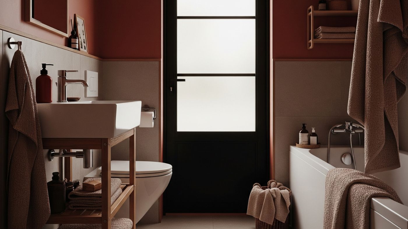
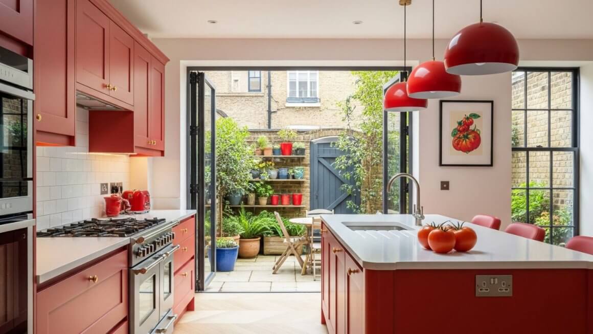
Tomato red
Moving away from juicy berry tones, this bolder, brighter red is more reminiscent of ripe tomatoes. Its slightly orange undertone makes it fresh and zesty, ideal for bathroom tiles, kitchen backsplashes or incorporated into artwork to add a Mediterranean flair. Choose sleek modern internal doors to keep this colour feeling cool and contemporary rather than garish and kitschy.
Some Extra inspiration from your “five-a-day”
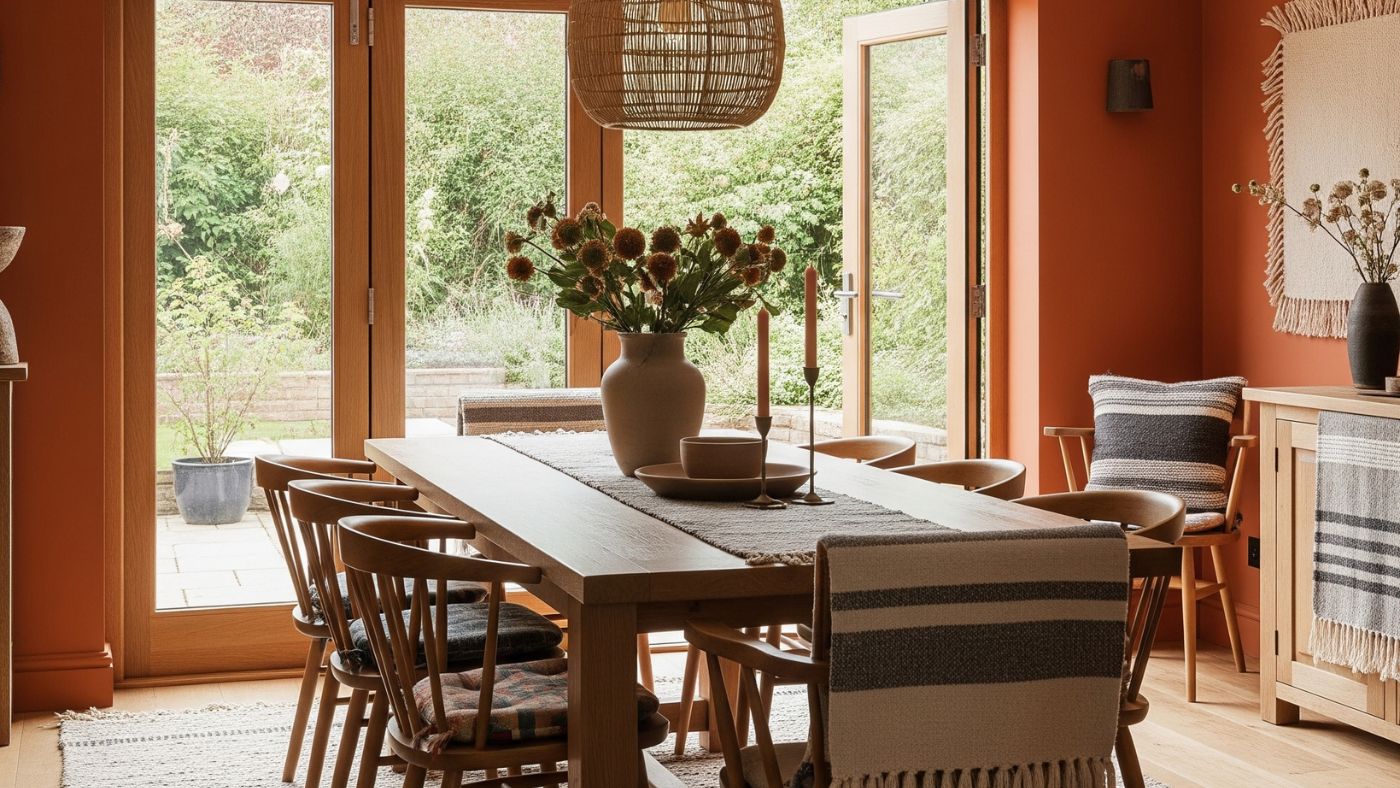
Shades such as olive green or burnt orange are classics that can’t really be considered a trend as they never go out of style. However, palettes inspired directly by root vegetables and leafy greens are gaining traction with more of us seeking a ‘grounded’ approach to interior design. Look to the natural world for inspiration and showcase dark and earthy tones for a sophisticated end result.
The “Foodification” of Colour
So why this trend? And why now?
For starters, food-themed interior design colours also take inspiration from natural earth tones and we’re instinctively drawn to these types of colours. And perhaps it’s a nod to our need for comfort and indulgence as the world becomes evermore hectic.
This “foodification of colour” as some are calling it, broadly speaks to a desire for warmth, familiarity and a sense of wellbeing in our daily lives. Practically, opting for these shades is a more low-key and approachable way to infuse extra colour and individualise our spaces. Perfect if you’re decorating a space and aren’t sure where to start.
Food-Themed Interior Design Colours
Why the Trend Works
Familiarity and Comfort
Colours such as butter yellow conjure up images of sun-drenched afternoons while something like Mocha Mousse might remind you of tucking into a hot chocolate on a cosy winter morning. This familiarity makes a space feel inviting and safe.
Sensory Connection
Food-themed interior design colours often carry a multi-sensory impact, reminding us not just of the visual appeal of our favourites but also the taste, texture and aroma. This deepens the connection we feel to our surroundings. The ultimate daily mood booster.
Nostalgia
Shades such as ‘oatmeal cookie’ or ‘blueberry milkshake’ bring us back to simpler times and childhood memories, adding a comforting layer of nostalgia to a room. Take inspiration from feelgood moments from your past and bring your updated take to classic design styles and shades from years gone by.
Practical
While seemingly specific to this particular trend, these tones can be surprisingly useful long term. A refreshing mint green is a cool replacement for typical neutrals while a cinnamon brown provides an energetic pop that’s equally timeless. Just what you need to add that unexpected twist while eliminating tricky decisions.
How to Use Food-Themed Interior Design Colours
Start Small or Go Bold
Paint
The most obvious way is through paint. Consider an accent wall in a succulent peachy hue or colour drench an entire room in a calming sage green.
Furniture and Textiles
Introduce colour through larger pieces like sofas or dining chairs, or via softer furnishings such as throw pillows, blankets and curtains.
Accessories
For a more subtle touch, incorporate food-inspired colours through decorative objects, ceramics, artwork or even themed kitchenware.
Natural Materials
Many of these colours pair beautifully with wicker, marble, internal oak doors and linen, enhancing the organic and comforting feel.
A Deliciously Stylish Interior Design Trend
The “foodification of colour” is more than just a passing fad; it’s a reflection of our desire for homes that feel nurturing, inviting and truly reflective of our personal tastes. Literally. Go ahead, treat yourself to a home transformation that feeds all your senses and contact us if you need ideas on the best internal doors to match. Bon Appetit!